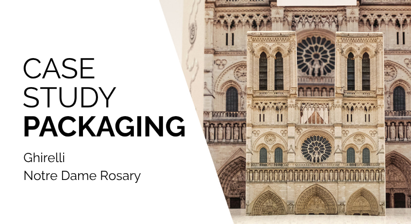
The reopening of the Cathedral of Notre-Dame de Paris, risen from the ashes after the devastating fire, is not only a religious event but a historical moment of global significance. When a product carries such a high symbolic value – like the special edition of the "Reopening Rosary" conceived by Ghirelli – packaging cannot be limited to protection: it must tell a story.
In this project, the role of Grafica Atestina was to translate the solemnity of Gothic architecture into a functional paperboard solution. We did not simply print a box; we engineered a die-cut packaging that physically replicates the lines of the Cathedral, transforming cardboard into an iconic three-dimensional object.
While the graphic design was provided by the client, our contribution focused on structural design: studying volumes, folds, and interlocking systems to ensure that a flat box could rise like a miniature monument, becoming a collectible item and a symbol of cultural rebirth.
From Gothic to die-cut: the challenge of shaped packaging
Translating the architectural complexity of a Gothic cathedral onto a flat sheet of cardboard is a pure structural design challenge. Unlike ECMA standards, such an articulated shaped packaging requires abandoning conventional geometries.
The technical objective was twofold: achieving a faithful volumetric rendering of Notre-Dame’s spires while ensuring industrial machinability, preventing the complexity of the shape from slowing down production or assembly.
The core of Grafica Atestina’s work focused on die-line development.
Using CAD software for packaging design, we transformed vertical elevations into an optimized two-dimensional layout. The main challenge lay in managing stress points: spires and flying buttresses, if not properly supported, tend to bend or break. We solved this by optimizing the paperboard grain direction, providing structural rigidity without increasing grammage, thus preserving elegance and lightness.
For assembly, we eliminated complex glue points in favor of a dry mechanical interlocking system. We calibrated the creasing lines with near-zero tolerances, allowing sharp and precise folds that simulate cut stone. The structure was engineered as an advanced self-locking box, ensuring both ease of assembly and product security.
This solution transforms opening into a fluid user experience, where stability comes from the balance of internal tensions, not adhesives.
The counter display: engineering for visual merchandising
If packaging is the main actor, the counter display is the commercial stage. In high-traffic retail environments, the display must not just store products but enhance visibility while ensuring maximum stability.
The challenge stemmed from the product’s geometry: the “cathedral boxes,” with an irregular base and high center of gravity, created balance issues. A standard display would have failed.
We developed a self-supporting structure in high-grammage paperboard, with millimeter-precise slots ensuring each unit is perfectly secured. This integrated locking system prevents wobbling and ensures orderly merchandising with high structural resistance.
We also optimized POP machinability: the display is delivered flat and assembled in seconds via a snap-lock bottom system, requiring no glue or staples. The result is structural strength and a premium printable surface, turning the display into a powerful communication tool.
Enhancements and printing precision: the tactile experience of luxury packaging
While structure defines volume, finishing defines perceived value. In this project, the challenge was both engineering and aesthetic elevation.
Printing on such a complex die-line requires perfect registration and infinitesimal tolerances, ensuring architectural details remain perfectly aligned.
We applied premium finishing techniques such as gold hot foil, creating visual highlights and enhancing perceived luxury. Material choice was equally strategic: a natural uncoated paperboard delivers a stone-like tactile feel, avoiding the artificial look of glossy laminations.
This combination creates a multi-sensory packaging experience, extending brand storytelling beyond purchase.
From standard to iconic: the competitive advantage of “out-of-scale” design
In a market full of standard boxes, breaking geometric rules becomes a key differentiation strategy. Packaging becomes the first salesperson of the product.
However, creativity without engineering can be risky. Grafica Atestina’s strength lies in industrializing uniqueness: transforming complex designs into scalable and machinable solutions, reducing risk while optimizing logistics and assembly.
We don’t just produce packaging—we deliver certainty, performance, and feasibility.
Is your product getting lost in a standard box? Standing out requires structural courage. If you have a concept that seems impossible, let’s explore how to make it real, producible, and effective.
Contact us for a technical consultation: together we will transform your idea into a high-performance die-line solution.