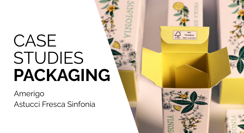
How do you package “energy”? For Amerigo’s Fresca Sinfonia line, a concentrate of lemon extracts, the challenge was not only to protect the product with effective cosmetic packaging, but to anticipate its vitality even before opening.
In this project, Grafica Atestina supported the brand by handling the packaging engineering solution and production management. While the graphic concept celebrated the vibrancy of citrus fruits, our task was to provide the ideal physical support: a structured, solid, and enhanced paperboard box capable of transforming a simple carton into a sensory experience consistent with the quality of its contents.
We didn’t just print: we engineered the entire luxury packaging supply chain and the container itself so that the visual freshness of the graphics would be supported by a rigorous internal structure, designed to protect the bottles and enhance them during the unboxing experience.
Engineering secondary packaging: the role of the platform separator
In the luxury cosmetic packaging sector, managing internal fitting systems is one of the most complex structural challenges, especially when working with primary containers made of glass or high-density materials.
For the Amerigo line, we went beyond the concept of simple containment by developing a secondary packaging engineering solution based on internal separators with a “platform” (marciapiede).
The “platform” is not merely an aesthetic feature, but a die-cut structural element that acts as both a lift and a spacer. This industrial packaging solution operates on three critical levels for product success on shelves and in logistics:
- Kinetic protection and buffer zone: from a technical standpoint, the platform creates a perimeter air gap that separates the bottle from the box walls. This configuration generates a programmed deformation zone (buffer zone): in the event of mechanical stress or accidental impacts during shipping, the board absorbs kinetic energy through its structural elasticity, preventing direct transmission to the glass. This provides superior protection compared to standard dividers, which is essential for reducing breakage rates in e-commerce and retail channels.
- Product stability and centering: thanks to micrometric creasing lines and interlocking joints, the separator holds the bottle in a fixed position. This prevents internal movement and ensures the center of gravity remains aligned—crucial for the stability of linear cartons during palletizing or shelf display.
- Unboxing marketing and perceived value: choosing an elevated support responds to packaging neuromarketing principles. Presenting the product on an internal “pedestal” enhances its perception of exclusivity (premiumness). The consumer perceives not only the cosmetic product, but also the care in its presentation, turning the opening into a high-end unboxing experience.
From an eco-design and sustainable packaging perspective, the entire kit (outer box and internal components) was designed using only FSC-certified mono-material paperboard.
This choice eliminates the need for polystyrene, thermoformed plastics, or polyurethane foams, making recycling easier for the end user. The precision of flat die-cutting ensures fast and smooth assembly, delivering mechanical stability that plastic supports often fail to match in terms of torsional rigidity.
Sensory enhancement and material contrasts: high-precision offset printing
Beyond structural engineering, the commercial success of secondary cosmetic packaging lies in its ability to activate emotional triggers through sensory neuromarketing. For the Amerigo line, surface treatment was not approached as simple protection, but as true packaging enhancement aimed at elevating visual depth and tactile quality through a sophisticated system of photometric and material contrasts.
The application of a matte acrylic coating is the first essential step in this enhancement process. Technically, this finish provides scuff resistance, a key requirement in the beauty sector to prevent micro-abrasions and unsightly “burnishing” caused by contact during transport and handling. Aesthetically, this matte layer creates a velvety, reflection-free texture that acts as a neutral canvas, absorbing light and significantly improving the readability of graphic design and informational text.
In sharp chromatic and material contrast with the matte background, the use of registered glossy UV screen printing (spot UV) defines the premium character of the box. This high-build industrial screen-printing technique is applied with millimetric precision only on selected graphic elements—such as lemon details and logos—creating highly reflective areas that actively respond to retail lighting. The result is a three-dimensional effect that guides the consumer’s eye to key brand elements, immediately conveying freshness and premiumness through a highly precise visual signal.
From a consumer behavior perspective, the tactile contrast between matte and glossy surfaces deeply stimulates the sensory system, increasing the time of physical interaction with the product on the shelf. The perfection of print registration—where gloss lands flawlessly on graphic details—is the technical parameter that defines excellence in luxury packaging.
This meticulous application of print enhancement techniques does not merely add ephemeral aesthetic value; it elevates the perceived price positioning of the Fresca Sinfonia line, ensuring that the brand’s energetic narrative remains intact and protected up to the moment of purchase.
Color fidelity and brand consistency: the science of “sun yellow”
Maintaining a strong and recognizable brand identity inevitably depends on rigorous Pantone color management—an aspect that becomes strategically critical in multi-SKU cosmetic packaging. For the Amerigo line, the technical challenge was to ensure absolute consistency of “Sun Yellow,” the spot color identifying the entire range, across multiple SKUs with different formats and volumes.
Ensuring that the 30 ml face serum box has exactly the same saturation and tone as the 200 ml bottle is not just an aesthetic concern, but a fundamental requirement for conveying authority and quality in premium positioning.
At Grafica Atestina, this industrial precision is achieved through advanced spectrophotometric print control systems. Unlike simple visual evaluation—affected by ambient lighting conditions (metamerism)—spectrophotometric control allows objective measurement of color reflectance throughout the offset printing process.
The key technical parameter is Delta E, the unit that defines the chromatic difference between the client-approved reference sample and the production sheet. By maintaining a Delta E close to zero and well below the threshold of human perception, we ensure millimetric color fidelity, eliminating tonal deviations that often affect fragmented productions or print runs carried out at different times.
The adoption of strict color management protocols and certified inks on high-whiteness substrates is essential to stabilize spot color performance. Color profiles are calibrated by considering the specific absorption of the paperboard and the influence of the matte acrylic coating applied afterward, which may slightly desaturate the pigment if not properly compensated during prepress.
This science-based approach reassures the brand about the stability of its visual identity: brand consistency is preserved across every retail shelf, regardless of the complexity or number of SKUs within the Fresca Sinfonia collection.
The practical benefit of such advanced color management translates into a direct competitive advantage: a packaging system capable of generating immediate consumer trust. A consistent, vibrant color instinctively communicates that the contents are equally controlled and refined, turning print perfection into a powerful marketing asset.
Strategic partnership: the value of the Full Service model and logistics kitting
The efficiency of a complex packaging project is measured not only by its aesthetic outcome, but by the manufacturer’s ability to absorb the client’s operational complexity. Grafica Atestina’s full service model is designed to provide complete control over the supply chain—from initial consultation on material selection to the logistics management of finished packaging.
This approach relieves the brand manager from coordinating design studios, color specialists, and multiple suppliers, ensuring a single point of contact responsible for both structural and chromatic quality across the entire range.
Beyond printing and enhancement, our management includes continuous technical validation and the ability to adapt production flows to market urgencies, whether for on-demand or large-scale runs. Operating in full service means eliminating risks of mismatch between prototype and mass production, ensuring that every SKU strictly meets machinability and stability parameters defined during the design phase.
The true completion of this integrated supply chain is represented by our kitting and assembly service. We don’t just deliver die-cut cartons: upon request, we internally manage the entire packaging setup process, manually inserting components and bottles into platform-based fitting systems or separators.
Delegating kitting to Grafica Atestina drastically reduces logistical steps between different contractors, cutting downtime and minimizing the risk of product damage. It is the ideal solution for those seeking a single supplier to receive a finished, controlled product ready for retail distribution.
Do you want your product to truly stand out in a saturated market? The difference between a box and a luxury architecture lies in the technical details we’ve described.
If you have an ambitious idea but are concerned about its industrial feasibility, put us to the test and contact us: we will transform your creative vision into a solid, refined, and flawless production reality.